Plot Gallery
A reference notebook of every plotting helper in assyst.plot. It loads a
small pre-generated Cu–Zn dataset (~1300 structures) so each example runs
in a second or two — feel free to swap in your own list of ase.Atoms.
The plots below are grouped into four families:
Overview — every plot at a glance,
Structural — cell-related quantities (volume, lattice parameters, angles, aspect ratios, sizes),
Composition — element concentrations,
Distances / neighbours — bond distances and radial distributions,
Energy — energy histograms and energy-vs-X scatter/hexbin plots.
Each example also notes the most useful keyword arguments.
Setup
import pickle
import matplotlib.pyplot as plt
import assyst.plot as aplot

with open("data/plot_gallery.pkl", "rb") as f:
    structures = pickle.load(f)

print(f"Loaded {len(structures)} structures")
Loaded 1345 structures
Overview
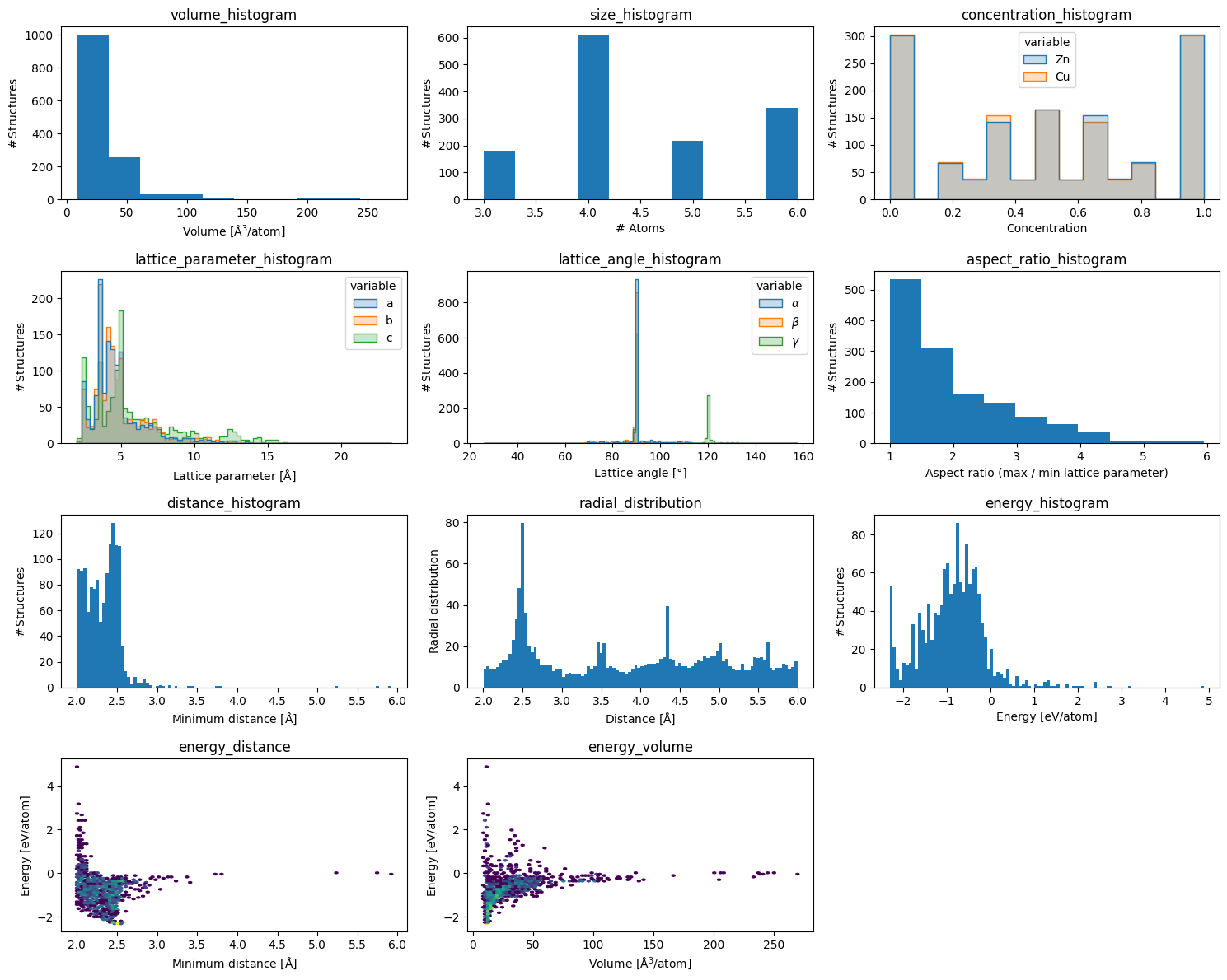
Every plot at default settings, side by side.
fig = plt.figure(figsize=(15, 12))

plots = [
    ('volume_histogram',            aplot.volume_histogram),
    ('size_histogram',              aplot.size_histogram),
    ('concentration_histogram',     aplot.concentration_histogram),
    ('lattice_parameter_histogram', aplot.lattice_parameter_histogram),
    ('lattice_angle_histogram',     aplot.lattice_angle_histogram),
    ('aspect_ratio_histogram',      aplot.aspect_ratio_histogram),
    ('distance_histogram',          aplot.distance_histogram),
    ('radial_distribution',         aplot.radial_distribution),
    ('energy_histogram',            aplot.energy_histogram),
    ('energy_distance',             aplot.energy_distance),
    ('energy_volume',               aplot.energy_volume),
]

for i, (name, fn) in enumerate(plots, start=1):
    plt.subplot(4, 3, i)
    plt.title(name)
    fn(structures)

plt.tight_layout()
Structural
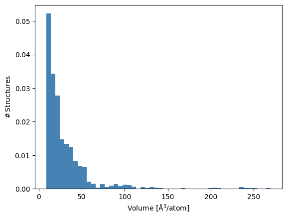
volume_histogram
Per-atom cell volume. bins controls resolution, density=True normalises
to a probability density, color picks the bar colour.
aplot.volume_histogram(structures, bins=50, color='steelblue', density=True);
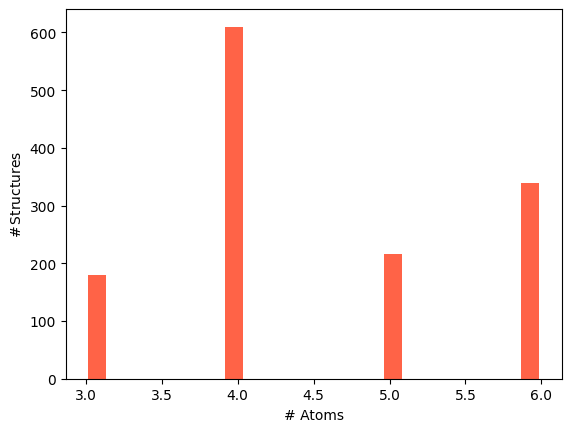
size_histogram
Number of atoms per structure. rwidth adds a gap between bars; useful
when bins align to integer counts.
aplot.size_histogram(structures, bins=20, color='tomato', rwidth=0.8);
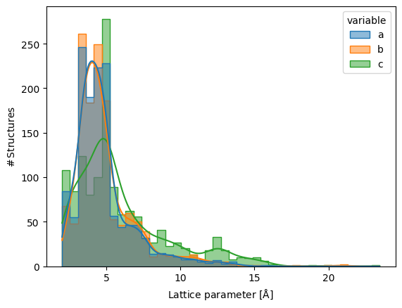
lattice_parameter_histogram
Lattice parameters $a$, $b$, $c$ overlaid in one panel. kde=True adds a
kernel-density estimate; alpha tames overlap between the three series.
aplot.lattice_parameter_histogram(structures, bins=40, kde=True, alpha=0.5);
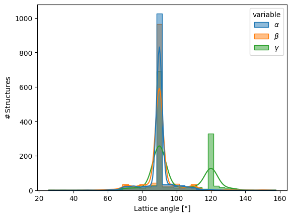
lattice_angle_histogram
Lattice angles $\alpha$, $\beta$, $\gamma$. kde=True is especially
helpful here — angles cluster sharply near 90°.
aplot.lattice_angle_histogram(structures, bins=40, kde=True, alpha=0.5);
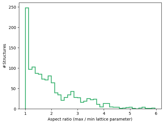
aspect_ratio_histogram
Ratio of longest to shortest lattice vector — a quick check for very
elongated cells. histtype='step' draws an unfilled outline; useful when
overlaying multiple datasets.
aplot.aspect_ratio_histogram(structures, bins=40, color='mediumseagreen', histtype='step', linewidth=2);
Composition
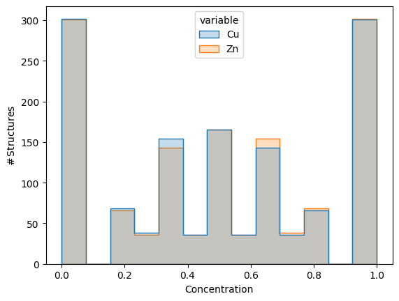
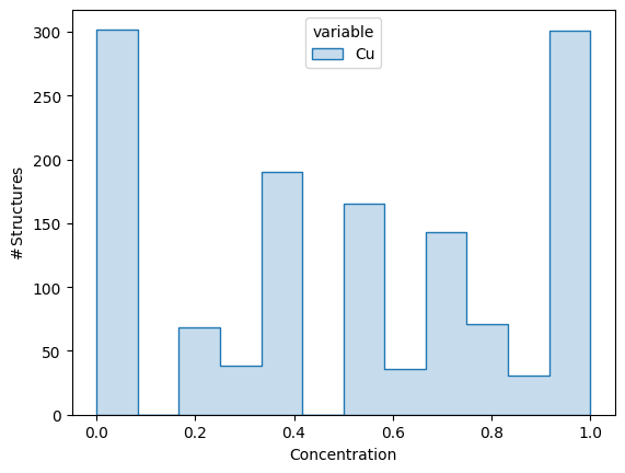
concentration_histogram
Per-structure concentration of each element. Pass elements= to restrict
which species are shown.
aplot.concentration_histogram(structures, elements=['Cu', 'Zn']);
aplot.concentration_histogram(structures, elements=['Cu']);
Distances and neighbours
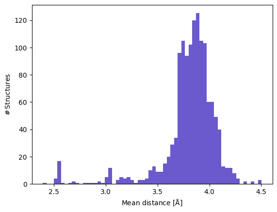
distance_histogram
Per-structure neighbour-distance summary. By default the minimum neighbour
distance per structure is binned; pass reduce='mean' for the mean or any
custom callable. rmax sets the neighbour cutoff.
aplot.distance_histogram(structures, rmax=5.0, reduce='mean', bins=60, color='slateblue');
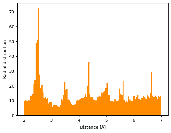
radial_distribution
All neighbour distances pooled together and weighted by 1/(4πr²) — useful
for spotting preferred bond lengths. Increase rmax and bins together
for finer resolution at larger distances.
aplot.radial_distribution(structures, rmax=7.0, bins=120, color='darkorange');
Energy
All energy plots require an attached calculator (e.g. a
SinglePointCalculator from a relaxation or an ASE calculator). Use
density=True when comparing datasets of different sizes.
energy_histogram
Energy per atom. density=True normalises to a probability density; log=True
switches the y-axis to log scale, which is useful when a handful of high-energy
outliers would otherwise compress the main peak.
aplot.energy_histogram(structures, bins=60, color='crimson', density=True);
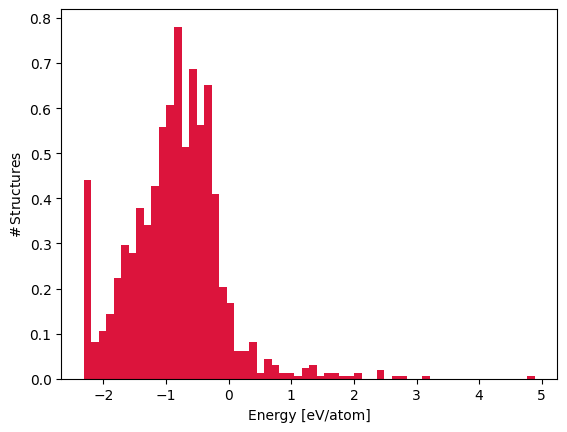
aplot.energy_histogram(structures, bins=60, color='crimson', log=True);
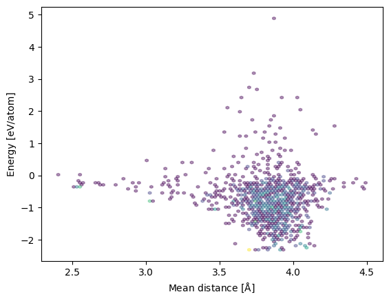
energy_distance
Energy per atom against neighbour distance. With ≥ 1000 structures the
function automatically switches from a scatter to hexbin.
aplot.energy_distance(structures, reduce='mean', rmax=5.0, alpha=0.4);
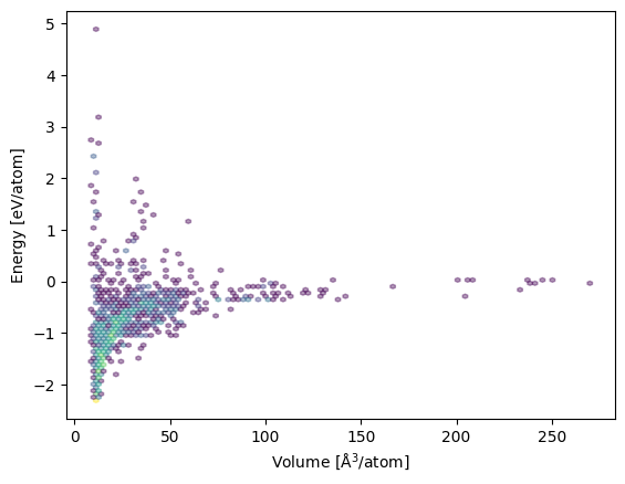
energy_volume
Energy per atom against per-atom volume. Same hexbin behaviour for large datasets.
aplot.energy_volume(structures, alpha=0.4);